Think of appearance as a system
Color, material and finish are often grouped together as CMF, but each does different work. Color shapes what people notice first. Material affects weight, touch and the way a part can be made. Finish describes the surface people see and feel: it may be matte, glossy, textured, brushed or coated. A coherent product appearance comes from deciding how these qualities relate, not from making every part look identical.
Start with the experience the product should create. A handheld tool might need surfaces that are easy to locate and grip, while a tabletop device might benefit from a quieter appearance that sits comfortably in a room. Write a short appearance brief describing the intended impression, the parts users touch or look at most, and the conditions in which they will use the product. This gives later choices a purpose beyond personal preference.
Give each component a visual role
List the visible components and decide which should lead, support or recede. A prominent housing can carry the main color; controls might use contrast to signal interaction; seams, fasteners and vents can be treated consistently so they do not compete for attention. These roles create a hierarchy that helps people understand the product at a glance.
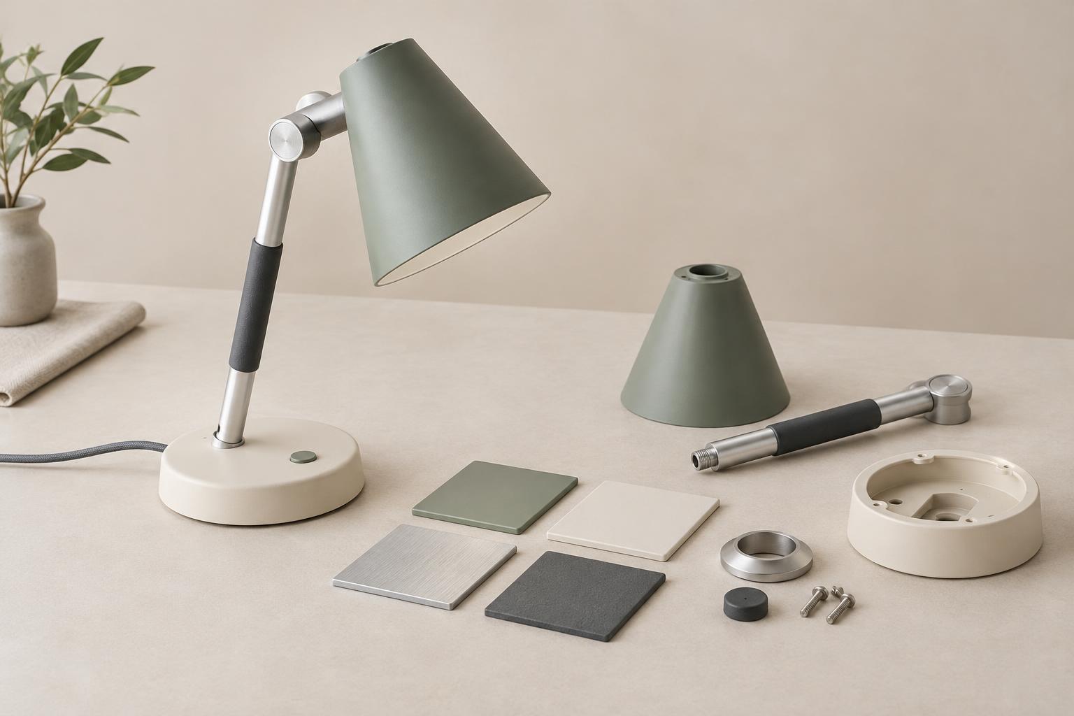
Coherence does not require one material everywhere. A soft grip and a rigid shell may need different materials to do their jobs. The design challenge is to make the transition feel deliberate. Consider where two materials meet, whether their textures have a similar visual scale, and how light changes their apparent color. Two parts specified with the same color may still look different if one is glossy and the other is matte, or if their underlying materials reflect light differently.
Keep the palette manageable. A main surface, a supporting surface and a limited accent are often easier to coordinate than many unrelated treatments. This is a starting point rather than a rule: the right number of treatments depends on the product and what users need to distinguish.
Choose finishes with use and manufacturing in mind
A finish should suit both the desired appearance and the way the part is made. Texture molded into a plastic part, a coating applied afterward and a brushed metal surface create different design and production requirements. Ask how the proposed finish behaves near edges, openings, parting lines and areas that receive frequent contact. An attractive flat sample may not reveal how the same treatment looks on a curved or detailed component.
Consider how the product will look after ordinary handling. Gloss can make marks and fingerprints more noticeable; some textures may collect dirt in recesses; exposed coatings can wear where parts rub. These outcomes depend on the specific material, process and use, so they should be checked with representative samples rather than assumed. Appearance also includes touch: a surface that looks refined in a rendering may feel slippery, rough or inconsistent in a physical prototype.
Manufacturing constraints can guide a stronger design instead of merely limiting it. If two adjacent parts cannot reliably match in sheen, a clear change in texture may look more intentional than an almost-match. If a seam is unavoidable, place and shape it as part of the product’s visual structure.
Evaluate combinations, not isolated swatches
Color chips and material samples help narrow choices, but they do not show the whole product. Build a sample board that places proposed surfaces beside one another, then move to physical prototypes with realistic geometry. View them from normal use distances and under the kinds of lighting the product is likely to encounter. Rotate the object: highlights, shadows and transitions can make a finish appear quite different from one angle to another.
Invite feedback on specific questions. Can users identify the control they need? Do the main surfaces feel related? Does an accent clarify a function or merely attract attention? Compare alternatives against the appearance brief rather than asking only which version people like best. Record what changed between rounds so a successful combination is not lost when one component is revised.
Define what must remain consistent
Once a direction is chosen, document it in terms a production team can use. Identify each visible part, its material, color target, surface treatment and any intended contrast with neighboring parts. Approved physical reference samples can communicate qualities that are difficult to capture in a screen image. Make clear which differences are intentional and which would undermine the design.
Plan for variation. Separate production runs, suppliers and processes may produce visible differences even when they aim for the same appearance. Review assembled products, not just individual parts, because adjacent surfaces make mismatches easier to see. A coherent CMF strategy is therefore both a design plan and a way to make decisions during development. It helps the team preserve the product’s character while adapting to the realities of making it.